A Tale of Two Scrollbars
Editorial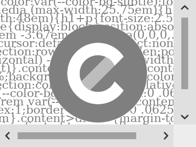
As indicated in my essay on going beyond the width of the viewport, I’ve allowed scrolling in two axes on this site, at least on devices with small screens.
I’ve even hinted what some of the effects of the redesign are, but the key takeaway is: Independent of screen size, you will always see a two-column layout. For this to make sense on your mobile phone, most of the right column is pushed outside the viewport, only a tiny part is shown to indicate scrolling horizontally is possible.
Sure enough, this is still based on the premise of good old responsive web design. While the width of the right column is always the same, the main content in the left column adjusts to cover most of the screen (up to a certain maximum width for readability). There is just one major breakpoint, at which the right column is no longer pushed off screen. Once I had that in place, it already reduced the responsive complexity.
To quote my essay, the important part was to ensure …
[…] reading the article is possible by scrolling down only.
Obviously, the main content will be put in the left column, elements like code blocks may span across both columns, and only complementary content—like an aside—should live exclusively in the right column.
39em (624px), beyond that the right column is no longer pushed off screen. As a result, in the 640px wide example everything is shown, no need to scroll horizontally.I made a little exception for Notes and article comments, their headings are also placed in the right column. This is something I already did in the previous print style sheet, and it has been the inspiration for the whole redesign.
With everything content-related in place, it was time to make design decisions for the site-specific components.
Header, Navigation, Footer
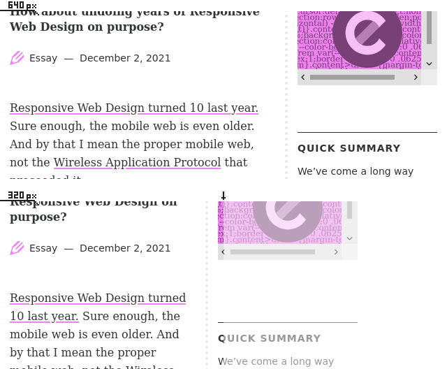
I could have just stretched header, navigation, and footer across both columns, but on small screens this would lead to their content being cut off uncontrolled, potentially not looking great. Instead, I had find ways to make a two-column layout work in those cases too.
While the actual content in its initial scrolling position shows a bit of the second column and a long vertical divider line all the way through, these components ended up with no indicator to scroll right.
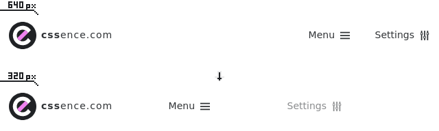
The Header
Luckily, the header already featured an additional Settings link that I introduced with in the Version 3 Redesign. Back then it was only shown on larger screens to achieve visual balance in the header, but now it became relevant to have something for the second column. I ended up putting the logo and the “hamburger” at opposite ends of the viewport, creating the illusion of a regular mobile header. Only to reveal the additional Settings link on scroll, which is right-aligned to the true end of the page. On larger screens, Menu & Settings sit next to each other on the right, as if nothing had happened.
The Footer
With the footer’s main purpose being a container for a pile of links, I’ve merely copied the header solution. Sure, there are way more links than in the header, but it became the same left/right/right alignment story, not even worth a screenshot. Unless this site had yet another redesign, you’ll see the live version if you scroll down.
The Navigation
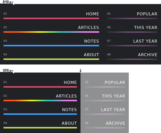
What ended up looking like another of copy of the header to some degree, had been a way more challenging process to get there. At first I tried arranging the navigation items in three or four columns, but there was no proper way to align the last column with the actual right column on every screen size. As I had already inherited four primary navigation items from v3.2, they eventually became even more prominent in v4, as they span the entire first column. While fine for any handheld operation, it may not be everyone’s cup of tea on larger screens. To fill the second column, it made sense to have the same number of items. Before the redesign, the secondary navigation contained a link to the Popular page, and one link for every year since I started this blog. I limited this to the two most recent years, so I had to make it possible to go back in time elsewhere. This gave birth to the Archive page, which also made it into the menu.
Guess what, there has been a brief period where a navigation design went live that looked very imbalanced, because the links in the second column looked like… well, most other links. The only way out was to give all items the same style. But this meant they all needed the large colored bar underneath, a scenario that has already caused the rainbow navigation item issue in the past. So I was really happy that I eventually came up with a solution that does not undermine the color codes. The color of the four secondary navigation items is derived from the accent color of the current page. This could still be the same as one of the colors in the left column, so to downplay the importance of the secondary items, I’ve used a radial gradient to make them appear dimly lit.
Back in the day, the CSSence wallpaper had been a signature element on every page of this site, but now in v4, the home page became its last resort. At the rate the wallpaper decreased in importance, the navigation took its place. I did not want this to end here, which is why I spent quite some time until I got to the result shown above.
Conclusion
In design, constraints can be a source of creativity. Forcing myself to make a two-column layout work on all screen sizes turned out to be an interesting exercise. I really enjoyed seeing the individual components on this site evolve into their current form.
I get paid to work on web accessibility, so I was initially hesitant to persue a page layout that goes beyond the width of the viewport. Hence, I’ll continue to look out for potential downsides, especially in regards to zoom on small screens. What do you think about scrolling both horizontally and vertically?