Style & delight
Redesign pt.2
Editorial
Prologue
Earlier this week, Sarah Drasner has been defending website fussiness. She writes about the little a-ha moments that make her stay on websites, pointing to excellent examples, where clearly their makers put in lots of additional effort, beyond merely chasing perfect Lighthouse scores. Her article conveyed a message I desperately needed to read, without it I would not have sat down to write the second part of this blog series.
When I decided to go for a redesign, it wasn’t because one has been long overdue. No, what I did was taking the next major steps to bring the content I’ve published elsewhere also to my own place on the web. Adding some kind of archive was on my to-do list, as my existing index pages only featured the most recent entries, so bringing in more of my old stuff increased that need even further. Being no fan of pagination, I was on a quest to improve my navigation overall.
When I wrote about URLs in part 1, I’ve already been indicating those topics. You know, structuring your own personal space ain’t easy. So for the rest of this article I’ll be focusing on the navigation, because this is where most of Style & Delight took place.
The CSSence wallpaper
A few years ago, I introduced the CSS wallpaper. A simple idea: Make the source code of the site’s inline styles visible and use it as the background. Wouldn’t work everywhere, but when CSS is part of your domain name, it kinda does. It has since been a very distinguishing feature, so I couldn’t eliminate it completely. Another thing I’ve mentioned in part 1 is that all posts on this site now start with the content, i.e. <h1>. What looks like a header is fake and exists only visually. Naturally this ended up being the place where the wallpaper continues to exist, it allows the fake header to sit on top of the actual content. Some of the links in the navigation at the end have special markup, so they can be used to appear in the header too. Clicking a link in the fake header basically triggers a click in the navigation below. You wouldn’t notice, as the fake header and the navigation are never visible in the viewport at the same time. A bit tricky to describe, I’ll dedicate a spin-off post with some example code to this. For now, let’s focus on the appearance.
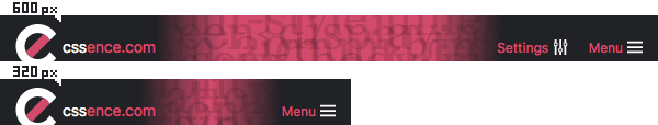
So we have the CSS wallpaper and three links in the header. The logo on the left takes you home, on the right you may navigate to the menu or the settings page. That last one I added for visual balance, both links on the right take up the same amount of space as the logo on the left. At least on larger screens, on mobile I do not show “Settings”, so everything fits while still allowing for a bit of wallpaper to shine through. In this case the visual balance is gone, we no longer have the same amount of space for links left and right, but we’ll get back to that.
To make the link text more legible, the links are not atop the wallpaper source code, instead there is a linear gradient that darkens said code where needed. Darken as in covering completely, the gradient uses almost-black without being semi-transparent. What’s rather neat is how I achieved the imbalance. You might be tempted to use a separate linear gradient on small screens, or even put some CSS custom properties inside the gradient and adjust those variables to offset the original gradient, but given how the gradient looks and repeats, I got away with offsetting it using good old background-position.
Lesson #1: Try to find the simplest solution for the task at hand.
The rainbow navigation item
Ah yes, colors. Way back I decided to put my posts in categories like “Code” and “Events”, and assigned a color and an icon (because color should not never be the only indicator) to each category. Initially I started with an odd number of menu items, but that no longer worked after the redesign. Aforementioned structuring turned out to be a tedious task, and I had to change it already once after launch.
To avoid ending up with seven menu items and a responsive design nightmare, I initially hid the not so important categories behind “More”, but that didn’t feel right the moment I put it online. As things progressed I grouped everything under two super categories. “Articles” feature all long-form blog posts, and “Notes” take care of standalone tweets, i.e. the ones that are not comments to articles.
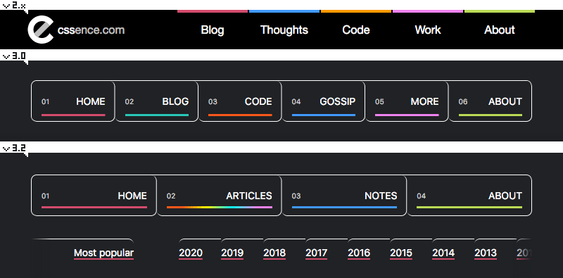
While all the regular category index pages continue to exist, the super category “Articles” allowed me to keep the menu items to a minimum, without the need for an infamous “More” section. Wait a minute. If all categories have colors assigned to them, which color will a super category get? “Notes” had only one color to begin with, as I never differentiated between tweet types. And for “Articles” the answer had to be: All of them, rainbow to the rescue. 🌈
There is just one issue. A category’s color happens to be the accent color on the individual pages, und that is used for lots of things, most prominently the link underlines. Not only would a rainbow underline require quite the effort, it would’ve also made the links stand out less. And apart from the navigation menu items, there is only one page on the whole site where this is needed in the content, and that is the article index page itself. So I ended up cheating by using the default color in header and footer, and for the content I assigned category colors depending on the link target. And unless you’ve specified a preference for reduced motion, the header will distract you with an animated rainbow background, to make the cheating less obvious.
Lesson #2: Sometimes it’s OK to take shortcuts.
The :target selector
Thanks to decent browser support for scroll-behavior: smooth, this time around I abstained from adding JavaScript to the hamburger menu, and went pure CSS instead. The Menu navigation item is simply an internal anchor link with #navigation in its href attribute, and using the :target selector allowed me to tweak styles when someone clicked it.
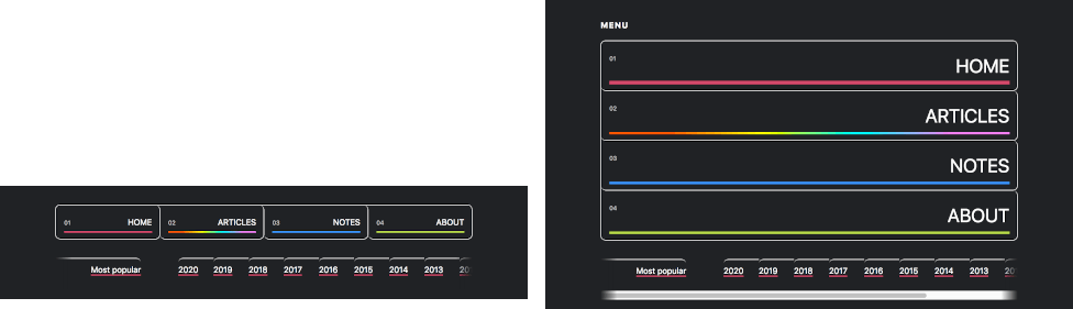
:target state on the right.Most notably, the menu items at the top grow immensely in size. But as the image also shows, at the bottom there are the archive links, which allow you to navigate by year. In :target state, a horizontal scrollbar appears, enabling you to travel back in time even further with a mouse. (Keyboard navigation will work in the both states.) The navigation adheres to the max-width of the content above, and this site has been online for a while now, so some not-so-recent years get cut off, courtesy of overflow: hidden. If you add up all those factors, no matter how big your screen is, the scrollbar would always be there. So for aesthetic reasons I only allow scrolling once my visitors put their attention to the menu.
Lesson #3: If you must add undocumented features, make sure they are discoverable.
Farewell CSS Easter egg
Let me end with something not related to the navigation. I had to say Goodbye to an old Easter Egg. I’ve been using the color #c55 (which you could read as “CSS”) as the background color for selected text, i.e. ::selection. For accessibility reasons I no longer adjust it and instead honor the visitors’ system defaults.
Most important lesson: Never sacrifice accessibility for visual gains.