Relative CSS units
Extra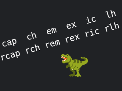
It was only last week when I learned we have cross-browser support for the lh unit.
Well, color me impressed, I realized its root relative companion rlh also exists, so I had to look up what else is out there, and it turns out we have all of them: Adam Argyle wrote about the relative units. They may have gone unnoticed now that those container units are all the rage.
In case you don’t know what they are for, MDN has you covered.
Since Adam wrote his piece, some progress was made, e.g. the cap unit now has cross-browser support. But most of the root relative ones have not, so either leave them be, or use them with a fallback in place.
A real world example
What I do like is that both lh and rlh are already usable. I’ve worked on a number of projects where I wanted the margin between two paragraphs to be the excact size another line of text would occupy. To achieve this, I’ve used em or rem and took the line-height into account, in other words I had to calculate the value upfront, or even throw custom properties at calc(). This is something I won’t need to do anymore.
p {
	margin-block: 1.5em; /* 1em × 1.5 (line-height) = 1.5em */
	margin-block: 1lh; /* ← but we can just do this instead */
}
Not only is the second one shorter (at least in this case), using lh makes it clear what the actual intent is.
The future
Things may even get more exciting once we have line-height-step, which is part of CSS Rhythmic Sizing. This might take a while.
For now, what I do like even more is that rex 🦖 exists.
Ah yes, I almost forgot: I’ve created an example page, that started out as a test page, but became an overview of all relative units, including the root relative ones.