Image comparison slider
CSS only, using the resize property.
Extra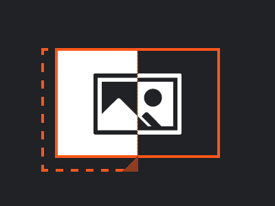
For an upcoming blog post, I wanted to create an image comparison slider that does not require JavaScript. Like others before me, I concluded I might be able to bend the resize property to make it work. But even eight years after Lea Verou created her proof of concept, with neat things like object-fit being supported across browsers, the situation is not perfect, nor beautiful.
But let’s start at the beginning, here’s a checklist of what we want:
- Display two images of the same size in the same spot, with a vertical slider on top. The slider may be dragged horizontally, and it’s position will determine how much of each image we will see. If the slider is placed exactly in the middle, we will see the left half of one image, and the right half of the other. Whereas in the left- or right-most position, one image is displayed in full, and the other not at all.
- The HTML must be meaningful, hence even without any styles applied, the markup must make sense.
- It must be accessible, so it has to work with keyboard too, and we’ll cover screen readers.
Not a long list, but already quite challenging. Given that resize only works when using a mouse, we’ll have to come up with a fallback behavior for keyboard navigation later. Let’s tackle the HTML first, always a good starting point.
The Basics
As we are about to compare images, it might be a good idea to put everything inside a <figure> element, but this is just an optional wrapper. Our solution will work for any element that has the .image-compare class.
<figure>
	<p class="image-compare">
		<span>
			<img src="image-1.png" alt="Explanatory text for first image">
		</span>
		<img src="image-2.png" alt="Explanatory text for second image">
	</p>
	<figcaption>Explanatory text for the overall comparison.</figcaption>
</figure>
You may have noticed the <span> element. To fast forward a little, I’ve already wrapped the first image inside a container with no semantic meaning, as this will become our resizable element.
The Breathing Space
The specification states which elements should be resizable, and while images may be covered, in reality there is no browser support. But we anyhow would not want to resize images directly, because of the breathing space we are going to introduce for the draggable handle. Without the breathing space, browsers won’t let us hide the first image completely, as the draggable handle needs to be visible, in order to be … well, draggable. Hence we add this space—an overflow area if you will—to have a parking spot for the handle when the first image is completely hidden, as the following diagram shows.
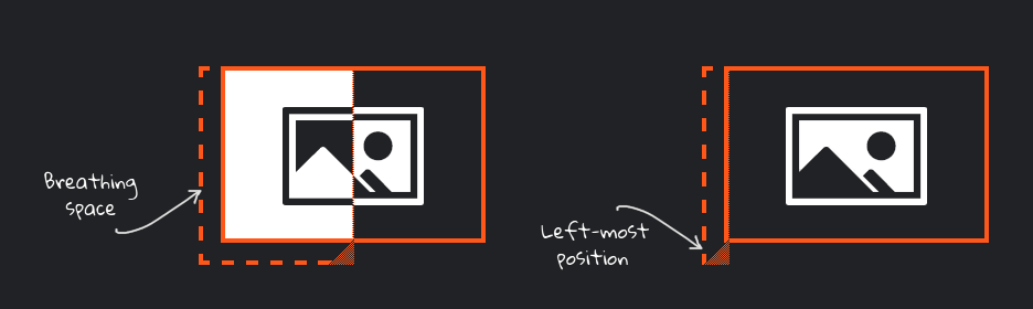
Using CSS, we will expand the resizable container to the left, and add a padding to push the image back into place, i.e. to where it would be without the expansion. We will do the same at the bottom, that space underneath will allow us to work around an issue in Safari, which I’ll cover later. Coming up with the right size is tricky[1], but our final example will feature a CSS variable for the size of the breathing space, so it can be easily adjusted.
The Styling
We’ll be using the center position as a starting point for the slider, so it becomes obvious that user interaction is possible here. To do that, we can no longer just set the width of the resizable container to 50%, as everything we do from now on needs to take the breathing space into account. So let’s bring in calc() to help us out.
.image-compare {
	--splitter-color: hotpink;
	--splitter-size: 0.125rem;
	--expand: 0.875rem;
	--handle-size: calc(var(--expand) + var(--splitter-size));
	position: relative;
}
.image-compare span {
	display: block;
	position: absolute;
	top: 0;
	left: calc(-1 * var(--expand));
	bottom: calc(-1 * var(--expand));
	width: calc(var(--expand) + 50% + var(--splitter-size) / 2);
	max-width: calc(var(--expand) + 100%);
	min-width: var(--handle-size);
	padding-left: var(--expand);
	padding-bottom: var(--expand);
	background: linear-gradient(135deg, transparent 0, transparent 50%, var(--splitter-color) 50%, var(--splitter-color)) 100% 100% / var(--handle-size) var(--handle-size) no-repeat;
	resize: horizontal;
	overflow: hidden;
}
.image-compare img {
	display: block;
	height: 100%;
	user-select: none;
}
.image-compare > img {
	max-width: 100%;
	height: auto;
}
.image-compare span::after {
	content: "";
	display: block;
	position: absolute;
	top: 0;
	right: 0;
	bottom: var(--expand);
	border-right: var(--splitter-size) solid var(--splitter-color);
}
That’s quite something, so let’s digest what is going on here. Only the second image is part of the regular document flow, and as such in charge of determining the height. This is usually he image’s actual height, but as the width is constrained by the container, wide images are shrunk, which also reduces the height to maintain aspect ratio. All the heavy lifting is done by the <span>, so here’s what it does:
- It contains the first image, and it is absolutely positioned, so it can be placed on top of the second.
- When it grows, it reveals more of the first image, so in turn we see less of the second; in other words, it uses
overflow: hiddento cut off none/parts/all of the first image. - But at the same time it expands to accommodate aforementioned breathing space, where the draggable handle resides. Expanding the area ensures the handle—unlike the image—is fully visible, despite the hidden overflow.
- It adds a vertical splitter (which sadly is not draggable) using the
::afterpseudo element. - Finally, it adds a linear gradient as a background image to make the draggable handle more prominent.
Accessibility Fallback #1
I’ve already hinted that we need to do something to support keyboard navigation, but this chapter is also be relevant for browsers on mobile phones, where resize might not even work. As it is not possible to make the actual resizing keyboard-controllable, we need to do the next best thing.
We’ll enhance the .image-compare element by adding three attributes:
tabindex="0"to make it focusable,role="img"so our two images become one unit,- and an
aria-labelthat is announced when the combined image is focused. (Side note: This accessible label supersedes the alt text of each individual image, but it is still a good idea to add proper alt text, as search engines and others might rely on it.)
Whenever our .image-compare element receives focus, the image comparison “happens automatically”, thanks to this animation:
@keyframes pingpong {
	0%, 100% {
		width: calc(var(--expand) + 50% + var(--splitter-size) / 2);
	}
	75% {
		width: var(--handle-size);
	}
	25% {
		width: calc(var(--expand) + 100%);
	}
}
.image-compare:focus span {
	background-image: none;
	animation: pingpong 5s linear infinite;
	resize: none;
}
And conversely, the animation stops when focus is lost.
Accessibility Fallback #2
We are in for a wild slide, which could be too much motion for some people, so let’s do one better. If we detect preference for reduced motion, we will fall back to a more subtle animation:
@keyframes fade {
	0%, 23%, 77%, 100% {
		opacity: 1;
	}
	27%, 73% {
		opacity: 0;
	}
}
@media (prefers-reduced-motion: reduce) {
	.image-compare:focus span {
		width: calc(var(--expand) + 100%);
		animation-name: fade;
	}
	.image-compare:focus span::after {
		display: none;
	}
}
The Safari Workaround
Safari (at least up to version 15.4) has two issues.
For starters, it does add a draggable handle to the <span>, but it places the image on top, so we can no longer grab the handle. I could not find a way to change the stacking order, which is why I made sure the handle is placed below the images. Hence I had to expand the breathing space also in this direction, which is now the default for all browsers.
The second issue is, on resizable elements, Safari treats width and height as min-width and min-height, so we’d no longer be able to hide the first image completely. To work around this, the left-most position needs to be the slider’s initial position. But this time I do not want other browsers to suffer, so we’ll limit this adjustment to Safari:
@supports (-webkit-hyphens: none) { /* Safari */
	.image-compare span {
		width: var(--handle-size);
	}
}
Verdict
While all of the above works, this is one of the cases where I cannot vouch for a CSS-only solution. Instead, you could bring in <input type="range">, update a CSS variable every time the range’s value changes, and take it from there. You’ll most likely need only a few lines of JavaScript, but you’ll end up with something superior to the poor man’s draggable handle we’ve seen here.
Showcase
View “CSS-only image comparison slider” on CodePen.
Footnotes
- The width of the breathing space has to be large enough to fit the handle. How large? We do not know, as it depends on OS settings and the browser. To be on the safe side you could simply make the breathing space very large, but there could be side effects. A large value could break the overall site design when our image comparison slider is present. It is unlikely to do harm horizontally, because we protrude to the side that won’t introduce an unwanted scrollbar. If at all, it could be an issue vertically, so you have to test. ↩︎