Image comparison slider, again
CSS only, using resize and logical properties.
Extra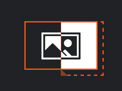
Last week I created an image comparison slider in pure CSS, and now I’m doing it again, only this time I’m using CSS logical properties. I’m aware of them, I’ve even used some of them in the past, but not all too often. Even though my employer pays me to work on an international web product that is running in six countries, the product lacks the need for logical properties, because the languages in all those countries to are read from left to right.
As a learning exercise, I wanted to work on something that contains none of the good old physical properties. Instead of coming up with a theoretical example, I took the slider to try it out.
Lessons learned
I’ve already been familiar with the block and inline dimension, so converting everything to logical properties was rather straightforward.
/* BEFORE & AFTER - a small selection of properties, taken from the actual code */

/* With physical properties: */
.image-compare span {
	top: 0;
	left: calc(-1 * var(--expand));
	bottom: calc(-1 * var(--expand));

	width: calc(var(--expand) + 50% + var(--splitter-size) / 2);
	max-width: calc(100% + var(--expand));
	min-width: var(--handle-size);

	padding-left: var(--expand);
	padding-bottom: var(--expand);
}

/* Now the same, but with logical properties instead: */
.image-compare span {
	inset-block: 0 calc(-1 * var(--expand));
	inset-inline-start: calc(-1 * var(--expand));

	inline-size: calc(50% + var(--expand) + var(--splitter-size) / 2);
	max-inline-size: calc(100% + var(--expand));
	min-inline-size: var(--handle-size);

	padding-block-end: var(--expand);
	padding-inline-start: var(--expand);
}
That said, there have been aha moments along the way.
New shorthands
Logical properties outnumber their physical friends substantially, because they provide individual shorthands for block and inline dimension. This is something I find myself using more and more, because it’s convenient. The assigned values on a single dimension are quite often the same. Let’s take inline, which amounts to horizontal if the block flow direction goes from top to bottom: Instead of specifying the same padding value twice for -left and -right, we can just write padding-inline: 1rem.
Conversely, padding-block can be used instead of -top and -bottom.
Four-value shorthands
The first logical property I’ve ever used was inset, which too can be found in the convenience department. However, this is also where the first aha moment kicked in while converting my image slider. I knew that inset takes up to four values, but as I learned on MDN, it is agnostic to the writing mode:
While part of the CSS Logical Properties specification, it does not define logical offsets. It defines physical offsets, regardless of the element’s writing mode, directionality, and text orientation.
So whenever you need to adhere to writing mode, you cannot use inset directly. You have to go the more verbose route and use inset-block and inset-inline in combination.
Eventually, this got me thinking about other shorthands that take four values, and I ended up on another MDN article that states:
The specification makes a suggestion for the four-value shorthands such as the margin property, however the final decision on how this should be indicated is as yet unresolved […].
Using any four-value shorthand such as margin, padding, or border will currently use the physical versions, so if following the flow of the document is important, use the longhand properties for the time being.
Background images
If you use a gradient like linear-gradient() as a background, and said gradient must adhere to the writing mode, making it work can be a bit finicky, as my final example shows. To keeps things DRY, I recommend using CSS variables that change based on writing mode, instead of jotting down the gradient multiple times.
Logical values
The source code above only shows logical properties, but there are also existing properties that can take logical values in addition to the physical ones you may be accustomed to.
This article in particular would not be complete without mentioning that resize takes logical values, so in my image comparison slider I replaced resize: horizontal with resize: inline. 🙂
Summary
While I’ve been dabbling in logical property waters for quite some time, I did so in the safe space of the left-to-right languages I’m used to. Which is why I switched to right-to-left as part of this learning exercise, and I can highly recommend it, as it will deepen your understanding of logical properties.
For this example, I did not yet flip the block and inline dimension, which is a thing in languages that are written from top to bottom. That’s an exercise for another day.
Showcase
View “CSS-only image comparison slider w/ Logical Properties” on CodePen.