Breakpoints for Print
A cross-browser nightmare
Extra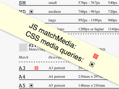
When was the last time you had to debug print styles? I ran into issues with media queries. This is not about @media print (which works as intended), but more specifically about responsive breakpoints.
If you are here for the tl;dr, I made a test page for web browsers, so you may want to jump over the bullet points and check it out. Maybe you too find it useful. As browsers hopefully improve over time, I myself will revisit this for further investigation.
Takeaways
On screen, using media queries to switch things around at certain breakpoints or depending on orientation works like a charm. Doing the same for print is a different story. It would be a long story, so let me give you the main takeaways instead.
- No JS
matchMedia. The only thing browsers seem to agree on is the complete lack of JavaScript support in print. Fair enough, it’s hard to send content to paper if it keeps changing. But between screen and print there is the printer dialog purgatory, where you can still make choices, so keep in mind: WhatevermatchMediadetected on screen will be sent to the print preview. If you make adjustments in print preview, e.g. choosing a different paper size, the JS media queries won’t be reevaluated. - CSS media queries on the other hand work just fine in print preview, unless the browser’s name is Safari, but I’ll get to that.
Now that we are in CSS-only land, what follows is a list of strategies, ordered by importance. I’d suggest you only read the first item in the list.
- Avoid breakpoints altogether. At the time of writing, there is no cross-browser way to achieve anything meaningful.
- Stick with
orientationonly. If you need different layouts for portrait and landscape, e.g. you want to adjust the number of columns, fine. But remember, Safari will be tied to thescreenorientation, which is usually landscape, so plan ahead to prevent an undesired result.
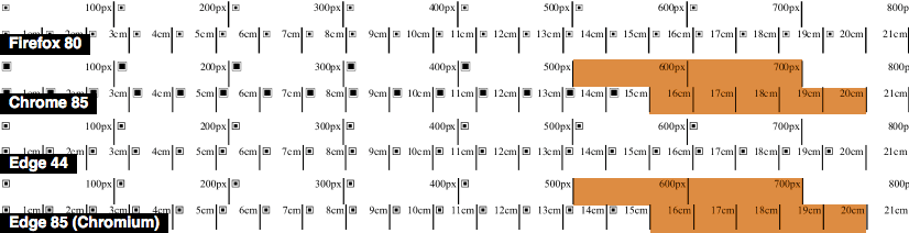
There should have been a third strategy on how you may actually use breakpoints with caution, but thanks to a bug in Chrome (and Chromium Edge) there is no such thing. If you add min-width or max-width media queries, things work fine for px and other absolute units on your screen. But Chrome is unable to replicate this behavior in print. Initially I thought this is due to not including the margin of the page, but the problem occurs no matter what the margin is set to. It used to work in Edge, but as they switched to Chromium, they picked up the bug too.
Additional observations
- Embedding style sheets with
media="print"or putting your styles inside@media printworks, but doesn’t magically improve things. Even this way Safari won’t make it to the party. - You may use the
@pagerule to align the default page margin across non-Safari browsers. - No browser supports
@pagedescriptors. However, you could add declarations likesizetoday to be future-friendly.
Despite lots of testing, there is a chance I got something wrong, so why don’t you head over to my test page on CodePen and try it out yourself.