Sliding Door, No More
Essay
Method obsolescence
March 2011, what a month! A hearty welcome to Internet Explorer 9 and Firefox 4. I wonder if I should include Google Chrome 10? Um, the people at the Googleplex deliver new versions up the wazoo, so for Chrome I guess it will be easier to welcome only versions divisible by three.
Let me start again by saying there are many browsers out there that support a whole lot of the new CSS3 features. So there is a good chance that some of us are still using CSS techniques that are no longer state of the art. What about sliding doors? Obsolete?
A brief history on sliding doors
Back in 2003, Douglas Bowman introduced sliding doors to the CSS community. Special-purpose images stacked up on top of each other could be used to create expandable buttons and tabs. Over the years, developers improved upon the original version, ending up with fully clickable regions that use only one image. Others have been inspired by Bowman and went on to use this for custom corners and borders in flexible layouts. I think it’s safe to say: If you’ve been dealing with CSS at an advanced level, you’ve been using sliding doors in one way or the other. Although many of these ways resulted in additional HTML markup that you needed as hooks for your styles, it was the best you could get out of CSS at the time.
CSS3 to the rescue
Multiple background images
Let’s jump to conclusions, shall we? The ability to assign more than one background image to an element seems to be just what we need to put an end to sliding doors. And best of all, our HTML file is not adding extra meat on its bones, erm, not adding markup just for style’s sake.
Specifying multiple background images is easy. Just use the background property the way you’re used to, but instead of applying only one image, repeat the syntax and add commas for separation, like so:
.multi-background-button {
	background:
		url(image-1.png) no-repeat left center,
		url(image-2.png) no-repeat right center,
		url(image-bg.png) repeat-x center center;
}
Needless to say, the order of the images is important, the one you specify first will be the one on top, followed by the second, and so on. If image-1.png in our example had no transparency and would be repeated (or is itself big enough to fill the whole area), we would not see anything of our two images underneath.
That is not our problem, on the contrary. image-bg.png is repeated all the way from left to right, if we place images that contain transparent areas on top of it, we’ll end up with this:
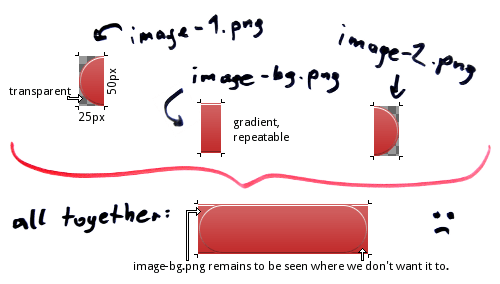
The intention here is to create a pill-shaped button, but our images overlap. Addressing this problem is one of the main tasks of the sliding doors technique. Margins are applied to the stacked elements to prevent the repeated image from interfering with our transparent ends. If you specify multiple backgrounds on one single element, you have no stacked elements where you could play with margins.
Note: Replacing the transparency in our images with a static background color would be a cheap (and lousy) fix. Furthermore, this particular example could be fixed by adding rounded corners, but that too is no real solution. We want something that works in any case, even with irregular shapes at one or both ends of our button.
While there are many things you can do with multiple background images—including effects such as parallax scrolling—, it turns out they are of little help when we want to replace sliding doors.
Border images
Luckily, CSS3 background is more than just multiple backgrounds. It’s got something called border images.
The syntax is tricky, but the general idea is to specify a border and apply specific parts of one single background-image to this border and the area within the border. Currently, border-image must be used with vendor-prefixes to work in Firefox and WebKit, which I left out for better readability:
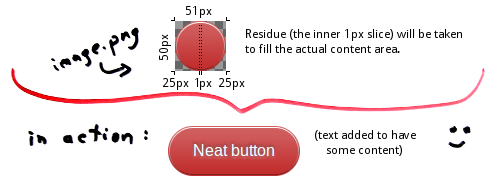
.border-image-button {
	border-width: 0 25px;
	border-image: url(image.png) 0 25 0 25 stretch stretch;
	height: 50px;
}
What have we got? In this case no border on top and at the bottom, but 25 pixel to the left and the right. As I’ve said, we need just one image for everything. The image.png I used is 51px in width and 50px in height. The syntax says, take this image, cut off 0 (read: zero pixels, aka nothing) from the top, 25 pixel from the right (I know it’s odd, but you have to write 25 instead of 25px), nothing from the bottom and again 25 pixel from the left. These slices will be displayed on the border, which is exactly why I specified a border-width of zero and 25 to match the cut-offs. So what’s left? After chopping off these slices from the original image we have a residue of 1px in width (51 minus 50) and 50px (50 minus nothing) in height. Said residue is put within the border, in the actual context area.
And then there are two more keywords (one for each axis, x and y) that tell the browser how to apply all the slices on the border and the residue within the border. In this case: stretch them. Of course, the image is designed to go well together with the specified measurements, hence nothing is stretched or distorted on the border itself. Only the residue will be stretched to fill the inner area from left to right. Try changing the height to 60px, and you’ll see the effect on the border as well.
For the finishing touch, I added some additional styles for the button text. If you want to see it in action, here is the button.png and the complete source code:
<!DOCTYPE html>
<html lang="en">
	<head>
		<meta charset="utf-8" />
		<style>
a {
	position: absolute; left: 5em; top: 5em;
	height: 50px; line-height: 50px;
	text-decoration: none; font-family: Arial; color: white;
	border-width: 0 25px;
	-webkit-border-image: url(button.png) 0 25 0 25 repeat repeat;
	-moz-border-image: url(button.png) 0 25 0 25 repeat repeat;
	border-image: url(button.png) 0 25 0 25 repeat repeat;
	text-shadow: 0 -1px 5px rgba(0,0,0,0.6), 0 1px 5px rgba(255,255,255,0.6);
}
		</style>
	</head>
	<body>
		<a href="https://cssence.com/2011/sliding-door-no-more/">Go to the article</a>
	</body>
</html>
To learn more about border-images, check out Nora Brown’s article at css-tricks.com, or simply play with her interactive demo.
Conclusion
Compatibility for older browsers aside, sliding doors are not meant to stay. Their spirit lives on in border-image.
If you’ve never heard of sliding doors you should still try to understand the underlying technique, as you may derive other creative uses from it. But when it comes to buttons, tabs and fancy borders, we’re going to see a decline in the use of sliding doors, if not a complete stop. After all, that’s one of the reasons why border-images have been introduced.