Accent colors
The CSSence color palette.
Easter egg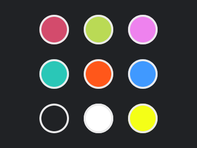
Colors have been used on this site to distingiush between blog post types for quite some time. But do these accent colors have Easter egg potential? Let’s find out by looking at the two most important colors.
Color #d34b6c
The quintessential color is the default accent color #d34b6c. According to this site’s about page, …
[the] color became the default when switching to a flat design in 2014.
I don’t remember how I ended up with this color. I know the ‘why’, it was because back then I switched my logo from PNG to SVG, and I needed a single color for the fill of the 45° bar.
#d34b6c as its default for more than ten years now.It still begs the question why I needed a color other than the one I already had in place: If you look at the thumbnail image of this ancient »Goodbye WordPress« editorial piece, you can see the old logo, which has three pink-ish colors, with #c94665 being the dominant one. The old color most likely was too in-your-face for the upcoming redesign at the time. An earlier design of this site used the accent colors for large background areas—among other things.
Accessibility may have already played a role too, however, white text on #d34b6c fails contrast requirements. 🤨
As said, I don’t remember, but the color is here to stay.
Bottom line, the color is what it is, that’s a fact.
Color #bada55
Let’s move on to the accent color for editorials and about pages. Similar to the default color, color #bada55 is another fact, not an easter egg. The only thing that gives it 🥚 potential is that it can be read as ‘badass’. There’s even a site named bada55.io, but I’m not gonna link to it, because of some questionable content, but more importantly because it appears to be insecure—lack of https is not an option in modern times.
Since we are already at the topic of color hex values that spell something, let me tell you that …
I really like
#c0ffee. ☕
Back to #bada55, which not only plays a role here, it also happens to be the dominant color on my résumé. (Perhaps I thought I’m a CSS badass.)
The name of the color is ‘June Bud’, which 1. makes it more adorable (unlike the badass thing), and 2. is something I’ve learned while writing this text. Personally, I liked the color when I first saw it. Having already used it on my résumé subdomain made it a contender when I came up with accent colors for the sections of this site, which happened a long time ago. Hardly a surprise it ended up being used for editorial blog posts and about pages, because those tell you more of a personal story, like my résumé does.
Dark mode
With the introduction of dark mode, things got more complicated. If you prefer a dark color scheme, you may not encounter any of the aforementioned colors. In dark mode, the default accent color is actually #aa425c, and editorials and about pages use #9fb751.
There’s even a story on how I came up with those dark mode color values.
The future
Eventually, things will get even more complicated. The new Elegant Style (see Settings page) does not distingiush between blog post types, #d34b6c is the only accent color, and it’s shown in both light and dark mode. When this style becomes the default, #bada55 won’t play a role anymore.