Not always mobile first
Essay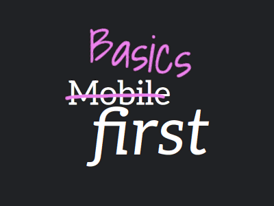
On the day this website stood still, which happened almost three years ago, I linked to an article by Ahmad Shadeed, “The State of Mobile First and Desktop First”. Ahmad states that he doesn’t stick to either method, instead he likes to mix them both. And he references an article by Elad Shechter, who calls this approach “Basics First”.
All I did when writing my article was to mention that I’m on board with mixing methods, but I never explained why I too think Basics First is the better approach, at least for web development. When it comes to web design, you can still go mobile or desktop first, whichever makes more sense. Well, let’s face it, mobile first makes more sense, and designers will disagree, given how limiting it is for them. But back to web development.
Buildup
Last month, two things have happened that made me want to (re)visit the topic.
First, I learned “How To Make a Website” on Henry Desroches’s website. Side note: Did I mention there is no redesign on the horizon for my site? Seeing how slick and clean Henry’s site is makes me wanna drop my current design immediately. Luckily I don’t have time for that. Anyhow, in Henry’s article there’s a chapter telling us to stop worrying about the cascade (I agree), which also contains a note saying we should be doing mobile-first design (I disagree, as we’re about to find out).
Second, I wrote »Superior range syntax«, and in there I explained how the new range syntax finally allows us to be precise when you query breakpoints. The moment you no longer stick to mobile or desktop first, you’ll most likely need …
[…] two types of queries in your stylesheet, one where the breakpoint is not yet reached, and one where it is.
So how do we apply Basics First?
Start with the basics
In Mobile First, you start with the mobile styles and @media (min-width: …) your way up.
In Basics First, you start with the mundane styles and hide the complex or fine-tuned stuff behind media queries. To do so, ideally you can start with the default the browser gives you out of the box, and enhance from there. As a result, a benefit of Basics First is that there is almost no need for overriding your own styles: Desktop does not need to override Mobile, and vice versa.
Isn’t Basics First anyhow Mobile First?
It may be, but not always.
Aforementioned complex stuff could either be in mobile or desktop territory. Quite often it is in the latter. Let’s take a look.
- A common theme on mobile is the “single-column long scroll”, i.e. something that may be covered by
display: block, which is the default for block-level elements anyhow. On desktop however, for certain parts of the page you may want to switch to horizontal orientation by using flexbox or grid. So this more complex style goes into a min-width media query. So far, no difference to the mobile-first approach. - What about the primary navigation of a site? On desktop you may end up with menu items layed out in horizontal orientation, while on mobile you’ll hide the menu items behind a hamburger button. In this case, we could argue both types are complex, and neither is built atop the other. So where to start, mobile or desktop? Well, in a true basics-first fashion, I define the shared styles (e.g. the individual menu items may look alike on mobile & desktop) outside any media query, and then diverge into both worlds with min and max queries.
- Which brings us to the last case, where the desktop version is simpler. Can you think of an example? Here’s mine: I usually align content such as images with the text, while on mobile I break out to the edge of the screen. This time I get the desktop alignment for free, and for mobile I place a negative margin inside a max-width media query. Et voilà, full-width images.
As always, your mileage may vary, those things depend heavily on the design you’re trying to implement. But hopefully this introduction to Basics First will start your own thought process.
While my goal is to reduce the number of CSS overrides, so I don’t end up with lots of strikethrough declarations in DevTools, I’m not overdoing it. Usually the result of Basics First is fewer lines of code altogether, but sometimes it’s the opposite. In that case—instead of painstakingly adhering to Basics First and the separation that comes with it—overrides are fine.
A word on native CSS nesting.
While this is not exclusive to the Basics First approach, being able to place media queries inside a selector allows you to bring the differences closer together.
.the-thing-to-style {
	/* basic styles go here */

	@media (width < 48em) {
		/* mobile styles go here */
	}
	@media (width >= 48em) {
		/* desktop styles go here */
	}
}
A word on the new range syntax.
If you haven’t read my article about the new media query range syntax and the issue it solves in the vicinity of a breakpoint, I encourage you to check it out.
A word on container queries.
While they are not top of my list, everything mentioned in this article may be applied to container sizes too, not just the viewport size.
Content First
That was all nice and well, but these days responsive web design has shifted towards going entirely without breakpoints. While this works to some degree, it may not take you across the finish line in all cases, so Basics First will still come in handy.
At the end of the day it’s not so much about the design, the actual content should always have a higher priority.