Color scheme switcher
Extra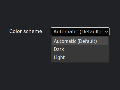
Welcome to level 8 of »Six levels of dark mode«.
When you build a color scheme switcher, sometimes also known as dark mode toggle, what do you add to the <html> element?
- A modifier class, like
.dark. - A data attribute, like
data-theme="dark".
Crickets.
Well, we no longer need either one, because we can use
:has()to query the real deal.html:has(meta[name="color-scheme"][content="dark"]) { --color-bg: black; --color-text: white; }
That looks rather verbose. Don’t worry, it’ll get worse.
But let’s not get ahead of ourselves.
Start without CSS
As a prerequisite, let’s assume we have a script that adjusts the content attribute of the color-scheme meta tag to either light or dark, depending on what the user has selected. (You can open the full example to follow along.)
For good measure, we add third state that sets the content attribute to light dark (yes, dark light would also work). This is the default when no scheme has been selected, i.e. we use the same scheme as the operating system.
Doing all this already gives us a working scheme switcher, without any CSS involved.
Add some CSS
You may now add whatever you need for either light or dark scheme, and then override things for the other. Let’s assume ‘light’ goes first, and ‘dark’ does the override.
/*
Set the light scheme upfront,
but override it with the dark scheme
when the user has explicitly selected it.
*/
html {
--color-bg: white;
--color-text: black;
}
html:has(meta[name="color-scheme"][content="dark"]) {
	--color-bg: black;
	--color-text: white;
}
That would even be it, if we only had two states. But remember the default? We need one additional chunk.
/*
	Also use the dark override when the user
	A. has a preference for dark scheme, and
	B. has not explicitly selected the light scheme.
*/
@media (prefers-color-scheme: dark) {
	html:has(meta[name="color-scheme"]:not([content="light"])) {
		--color-bg: black;
		--color-text: white;
	}
}
This is the minimal setup, you can expand it from here.
Now I hear you say, “that’s all nice and well, but a simple .dark class at the HTML element is way easier‽”
Agreed. However, the reason for doing it this way is similar to applying styles based on ARIA attributes. Imagine a button that opens a dropdown, it has a nice little triangle marker to indicate the fact. Sure, you can add an .expanded class to the button when it has been clicked, and rotate the triangle based on that class. But, you could also rotate the triangle based on [aria-expanded="true"]. Doing the former, all you are testing is whether adding a class works. Doing the latter, you add a built-in test for the underlying accessibility feature.
The same can be said for the long selector in this blog post. Using it adds a test for the HTML+JS version of the color scheme switcher, free of charge.
Luckily, native CSS nesting has arrived, so you do not even need to repeat the long selector, you can just add everything in there.
I’ll acknowledge there is a downside, but it has nothing to do with the selector, because the downside is also present when doing it the old-fashioned way: Due to the non-boolean nature of our scheme switcher, we have to duplicate the override styles, because even with CSS nesting we cannot combine a media query and a regular selector.
One more thing: You can also use the tilde attribute selector on the content attribute.
/* You can use this instead of `:not([content="light"])` */
html:has(meta[name="color-scheme"][content~="dark"]) {
	/* matches "dark", "light dark", and "dark light" */
}
That’s it. If you didn’t already, head over to CodePen to see a working color scheme switcher.