aspect-ratio gotcha!
Extra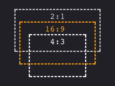
Imagine you have a picture of a cat, and the image has a 4:3 aspect ratio.

Now imagine you do not want to display it as-is, but instead you want to crop it to end up with a square image, in other words the image should have a 1:1 aspect ratio.
Luckily we have object-fit for quite some time, which allows us to do the cropping. We no longer need to involve background images, we can simply use object-fit: cover and off we go. To turn aforementioned 4:3 image into a square one, all that is left to be done is to ensure width and height have the same value. Or, ensure inline-size and block-size have the same value, because that’s what the cool kids are using these days.
img {
	object-fit: cover; /* to avoid a stretched image */
	inline-size: 20rem;
	block-size: 20rem; /* identical values for x + y */
}
Next up, instead of setting both inline and block size, we could just use one of the two, and accompany it with aspect-ratio: 1 / 1.
img {
	object-fit: cover;
	inline-size: 20rem;
	aspect-ratio: 1; /* shortened variant of "1 / 1" */
}
So far, both ways will give us the same result. Setting the aspect ratio prevents repeating the size, so I’d usually go with that.
Even more so, the second version is what you will have to use when you don’t have a fixed size, i.e. in a responsive scenario, where the inline size should take up the available space. Setting the inline size to 100% will do just that, but depending on how your HTML is set up you may now no longer be able to do the same for the block size. Don’t worry, aspect ratio is here to save the day.
img {
	object-fit: cover; /* to avoid a stretched image */
	inline-size: 100%;
	/* block-size 100% may not work, so ratio it is! */
	aspect-ratio: 1;
}
Here comes the gotcha!
For this last part, imagine the image you are trying to style has dimensions set in HTML. If you now simply did the same as in the last part, i.e. setting one dimension and aspect ratio, your image will end up stretched, because it already has both dimensions set, albeit in HTML and not in CSS.[1]
<img src="…" alt="…" width="400" height="300">If your HTML would allow it, you could obviously simply remove the attributes there. If not[2], you have to go the extra mile: In order to undo the damage, you need to explicitly set either inline or block size to auto. Voilà, you’ve got your responsive behavior back.
img {
	object-fit: cover;
	inline-size: 100%;
	block-size: auto; /* undo the <img height> attribute */
	aspect-ratio: 1; /* perfectly fine now! */
}
Showcase
View “aspect-ratio gotcha” on CodePen.
Update
When I first published this blog post, I incorrectly assumed that you cannot use aspect-ratio when sizes are set in HTML, and instead have to go back and explicitly set both dimensions. Luckily, Roma Komarov reached out and pointed me to the solution.
Footnotes
You could argue whether this is a bug or not. However, all the browsers I’ve tested agree in not supporting it.It is not a bug, as Roma pointed out on Mastodon. You need to give the browser a hint, so it knows which axis it can tamper with. ↩︎- In my case, I stumbled over this gotcha when I added dimensions to the thumbnail images on this site. I’ve set a smaller width & height compared to their actual dimensions, so the thumbnails are not too in-your-face for visitors who decide to display CSSence.com without styles, or for all visitors on April 9. ↩︎