Structure & semantics
Redesign pt.1
Editorial
It all starts with URLs
Like I said years ago, in the aftermath of my JavaScript Wars essay:
There is another building block for the web, one that is more important than HTML, CSS and JavaScript combined. It all starts with URLs.
While my latest redesign did include lots of visual changes, the even bigger part has been a complete reorganisation of the content. Before the change, my posts were split up into the sections they belonged to, i.e. all essays have been served under /blog, while my tweets were located under /gossip. These folder names have also been used to serve the index pages, nice hackable URLs. But this approach wasn’t very flexible, and sometimes the lines between those sections were blurry.
After a lot of back and forth, I decided to use the year as the topmost (and only) way to structure the content. The URLs are still hackable, so /2020 lists posts from the year 2020. But years are just one type of index, I still have sections, even though I’m using new names. Then and now, sections list only the ten most recent posts. Contrary to that, the year-based index pages show all posts of that year, so the redesign neatly solved my I need an archive issue.
Link rot
Link rot is the entropy of the web,
says Jeremy Keith, and he even bet on it. People don’t live forever, nature has four seasons, there is always decay, which is a good thing. But when it comes to URLs, I think we have an obligation to keep them alive as long as possible and feasible.
Somewhere out there, websites are still linking to my posts using those now deprecated URLs. This includes links in content I myself have created, but on other services that are out of my control, mainly Twitter. As I cannot update my tweets, old links to my site would reach a dead end. Luckily there are redirects, and thanks to my host Netlify I have an easy way to specify them, so old URLs remain intact. For example, my aforementioned »JavaScript wars« essay can still be reached via the no longer used URL /blog/2016-11-the-javascript-wars; the browser gets instructions to forward the request to /2016/the-javascript-wars.
But enough about URLs.
HTML
None of them fancy Single Page Applications (SPA) would exist without at least a mouthful of HTML. SPAs typically give you an empty container, only to put a script in charge of getting your content. This site is no SPA, each request delivers a full page. FYI, that makes sense for a web log. Ah yes, the content, this is where it starts to get interesting.
Heading level one
»More death to more bullshit«, a chapter in Vasilis van Gemert’s thesis »Exclusive Design«, has been my inspiration to try out something that websites did in the last century, but at some point stopped doing.
Almost all webpages start with a navigation with all kinds of links that try to convince you to go to another page. If you think about this for a minute it sounds ridiculous. Why would you want to start a webpage with pointing people in other directions when they just followed a link to this specific page?
He argues that we should get our priorities straight, which I did. Now every page on this site starts right with the content, specifically with the page title.
As I will show you in part 2 of this series, this is not just about placing the navigation and other things further down, only to mess with source order later, using styles to rearrange content. No. I’ll let you know how I still got something that visually looks like a classic website header.
Starting with the content means there is no need for skip links. I did add some, but they might not even count. They are at the end of each page and always visible. They take you back to the top or other places on the current page.
Solved issues
Every so often, I encounter tweets that say something like it is 2020 and there are still blog posts that do not show the date of publication.
(Most prominently, Sara and Bruce told me so.) Well, that was something my 2016 redesign didn’t properly take care of. All my pages did show when they were published and/or last updated, but the information was placed after the page content, together with other metadata. I’ve decided to duplicate the date, so I can also show it up top, where it is more common.
Last but not least, I’ve added a proper heading (level 3) to each individual comment, a shortcoming I wasn’t even aware of, and ensured that all headings have unique IDs, so they can serve as anchor link targets.
In closing
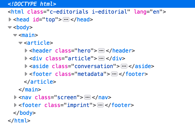
To get a really good grasp how each page is marked up, you should look at my site without any styles applied. You may have your own way to accomplish this, but this will even become a feature when I find the time to add this to my Settings page.

<div> elements, never more than five per page.