Root Em (rem), a unit introduced with CSS3
Essay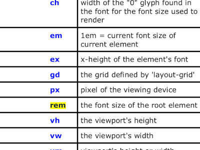
One of the most important files on my laptop at home and at the office is the handy CSS3 cheat sheet, available for download at veign.com.
A couple of days ago, for reasons unknown, the term rem on the last page of said document caught my eye.
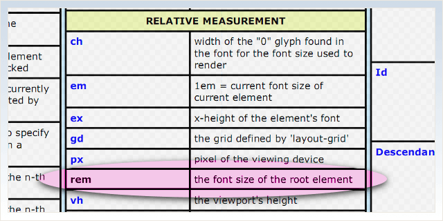
Relative measurement
In CSS3, rem has nothing to do with rapid eye movement, it is an abbreviation for root em. The cheat sheet told me, if I’m going to use rem I get the font size of the root element
.
I had a hunch what was going on here, but I took a closer look.
The difference between em and rem is, rem values are not relative to their parent, but to the root. In this case, the root element is not the document body, it really is the document root, i.e. <html>. So all we have to do is specify a font size for the html element and make all other elements relative to that value.
html { font-size: 1.25em; }  /* 16px ✕ 1.25 = 20px, details below */
body { font-size: 0.75rem; } /* 20px ✕ 0.75 = 15px */
pre  { font-size: 0.65rem; } /* 20px ✕ 0.65 = 13px */
Keep in mind, the font size for the html element itself can be either absolute or relative. In our example, 1.25em would be relative to the browser default, which is usually 16 Pixels.
But back to the rem values. Let’s say all we got is the three declarations above. If we had given our preformatted text a font size of 0.65em, we’ll get approximately 10px (15px ✕ 0.65 = 9.75), because these ems would be relative to the value found at the body.
So what? Mathematics 101, why not specify pre { font-size: 0.86667em } in order to end up with the desired size (15px ✕ 0.86667 = 13px)? The answer lies in the reason why root em has been invented in the first place.
Nested elements
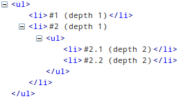
The basic advantage of the rem unit is that for nested elements the font size is no longer decreased or increased ad infinitum. For example, if you apply a font size of 0.9em to list items, this will give you a font size of 0.81em (0.9 times 0.9, or 90% of 90%) at the second depth level. And so on.
Thanks to rem, instead of a) resetting the font size, as in li li { font-size: 1em }, or b) switching from element selectors to class selectors, or c) insert-your-own-personal-old-habit-here, you can simply apply a font size of 0.9rem. And you are done!
Typical usage
Today, using relative measurements is the norm in web design, and that applies not just for font sizes. But especially with font sizes, you’ll be glad having used relative values the very moment your client comes up with the requirement to implement a JavaScript font size selector.
With nothing but relative values in place, simply adjust the base font size of the html element, and all other elements will follow suit. Granted, this is possible with ems as well, but with rems it got even easier.
Browser support
Browser support is actually quite decent, as Jonathan Snook points out in his excellent article on the subject.
Should we use the rem unit?
Yes, you can start now. But as always, just make sure to provide a fallback for older browsers that do not support rem units:
p {
	font-size: 16px; /* fallback */
	font-size: 1rem;
}