Maintaining aspect ratio with CSS grid
With the help of an empty SVG
Extra
Yesterday this Medium post by Noam Rosenthal was brought to my attention when CSS-Tricks called it a clever aspect-ratio trick that involves using an inline SVG with a viewBox to push out the size, and CSS Grid to overlay the content.
Before Noam came up with this neat idea, the percentage padding hack was the only way to maintain the aspect ratio of anything but images. He on the other hand put an empty inline SVG in charge of maintaining the aspect ratio. Clever indeed! But in his solution, the SVG was part of the HTML, which is why I started playing around with it a bit more. I wanted to find out if it could all be done in CSS. Looking at some unused code in his Pen, I think Noam already tried to achieve something similar.
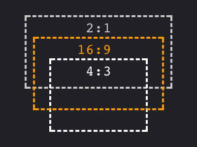
So here we go. When generating ::before and ::after pseudo-elements, we need the content CSS property. You probably know that this property can also take a URL value, so we can turn the SVG into a data URI. Doing so without any base64 encoding, we end up with some still readable code. If you take a close look on the viewBox attribute in the example below, you’ll notice the we are going to use this example to maintain a 16:9 aspect ratio. Need another aspect ratio? Simply adjust the viewBox attribute.
.container::before {
	content: url("data:image/svg+xml,%3Csvg viewBox='0 0 16 9' xmlns='http://www.w3.org/2000/svg'%3E%3C/svg%3E");
}
Using these lines, I’ve been able to rewrite Noam’s example so that the SVG is no longer part of the HTML. If you kept up with CSS Grid, i.e. the work of Rachel Andrew and Jen Simmons, you know that generated content pseudo-elements are treated as grid items. So now, if I simply use the ::before pseudo-element, I can put the actual content on top of the generated SVG in the same way Noam did.
Encore
Having done that, I asked myself why not use the original percentage-based approach, but with CSS Grid instead of absolute positioning? So I ended up adding all three approaches for easy comparison on CodePen.
Now what?
I’d argue that the original approach will still be around for a little while, but it is good to have alternatives.
- Keep using the Percentage-Padding method for better control on how to handle the
overflow. - Use the SVG method if applying
position: relativeto your container is not an option, e.g. if your content has children that need to break out in a special way. - Do some testing before using the CSS Grid + Percentage-Padding method, as there seem to be cross-browser issues. I’ve seen inconsistencies in Firefox and Safari, hopefully I’ll find the time to investigate further.
While researching for this example, I found a number of interesting articles on the subject. Maybe at some point we might no longer need hacks and we’ll be able to maintain aspect ratios directly in CSS.