VoiceOver table issues
Do we have to say “Goodbye” to flex/grid table rows?
Extra
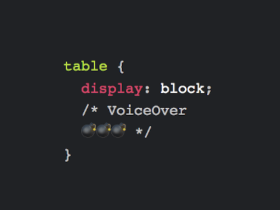
Today at work I’ve been debugging an accessibility issue with one of our more complex tables. After several hours I drew the conclusion that VoiceOver on Mac trips up on tables that have display: table taken from them. It might still recognize it as a table, but you can no longer navigate the cells inside.
I’ve tested VoiceOver on Mac (no iOS) in Safari, Chrome[1] and Firefox. Results are all pretty much the same across browsers.
While you should always have proper semantic HTML table markup, there are a lot of good reasons to apply styling so they end up looking less like tables, e.g. to create responsive tables on different screen sizes, or to have cells that can be expanded and collapsed. Especially table rows are good candidates for turning their cells into flex or even grid items.
That said, I still need VoiceOver users to be able to navigate the table content as intended. So unless I made a mistake in my tests, I guess I have to go back to display: table and table-layout: fixed.
If you have any experience in this regard, please let me know in the comments.
Showcase
View “Do not feed HTML table without display:table to VoiceOver (Mac)” on CodePen.
Confirmation & Updates
First of all, thanks to Adrian Roselli and Manuel Matuzović I’ve got confirmation. According to the link Manuel sent me, Adrian already wrote an excellent article on the subject, and now I also know that this is not limited to VoiceOver. NVDA on Windows is no different, because the browsers strip away the table information, leaving screen readers clueless.
Best of all, Adrian keeps adding additional information, in his most recent update he highlights that Chrome 80 fixed the issue. Bug is still there in Safari and Firefox, so if you are using one of them, you may head over to my CodePen for a test.