Preventing Orphans in Flexbox

Using :nth-last-child to avoid a standalone element.

Code

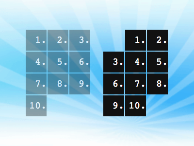
Preventing orphan elements with pure CSS—more on that in a bit—might not be something you’ll actually want to pursue, but it gives us a good reason to learn more about the :nth-last-child selector.

Some groundwork

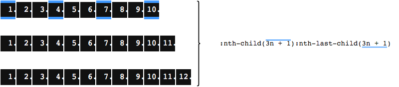
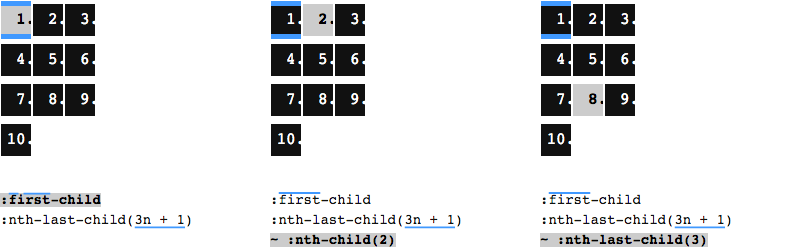
While :nth-child(3) can be used to select the third child inside a container, :nth-last-child(3) selects the antepenultimate child, because we start with the last child and count backwards. To select not just one but every third child, we use :nth-child(3n) or :nth-last-child(3n).

Top: A list with 10 items; the third item is highlighted thanks to nth-child(3); the eighth (i.e. third from end) is highlighted thanks to nth-last-child(3). Bottom: Another list with 10 items; items 3, 6, and 9 are highlighted thanks to nth-child(3n); items 2, 5, and 8 are highlighted thanks to nth-last-child(3n).

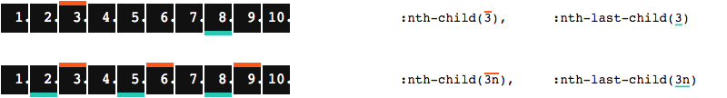
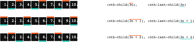
We can add positive or negative offsets. E.g., to select each child that follows immediately after every third child, we put 3n + 1 inside the parentheses.

Top: A list with 10 items; items 3, 6, and 9 are highlighted thanks to nth-child(3n); items 2, 5, and 8 are highlighted thanks to nth-last-child(3n). Center: Another list with 10 items; items 1, 4, 7, and 10 are highlighted thanks to both nth-child(3n + 1) and nth-last-child(3n + 1). Bottom: One more list with 10 items; items 2, 5, and 8 are highlighted thanks to both nth-child(3n + 2); items 3, 6, and 9 are highlighted thanks to both nth-last-child(3n + 2).

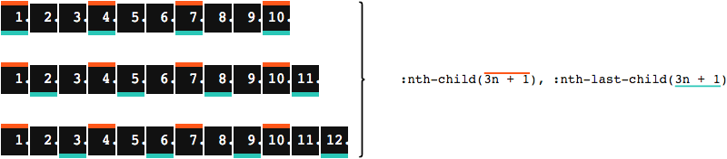
Let’s keep the focus on 3n + 1, as this is where in the depicted example both nth-child and nth-last-child target the same elements. Which is simply due to the number of elements we have in total. If we add children to the container, things run out of sync. (In this particular case, only if we add one or two elements. Adding three elements brings things back in sync, courtesy of the 3n part in our selector. And so on.)

Top: A list with 10 items; items 1, 4, 7, and 10 are highlighted thanks to both nth-child(3n + 1) and nth-last-child(3n + 1). Center: A list with 11 items; the same items as in the top list are highlighted thanks to nth-child(3n + 1); but now items 2, 5, 8, and 11 are highlighted thanks to nth-last-child(3n + 1). Bottom: A list with 12 items; again, the same items as in the top list are highlighted thanks to nth-child(3n + 1); but items 3, 4, 9, and 12 are highlighted thanks to nth-last-child(3n + 1).

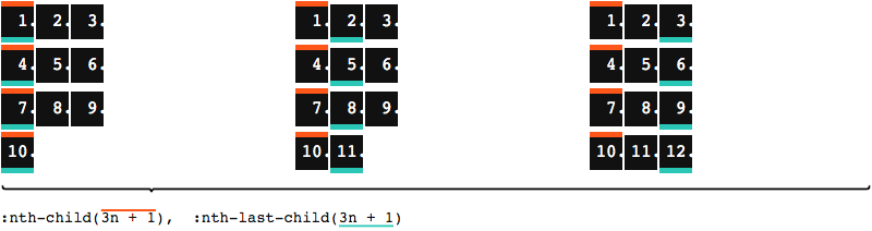
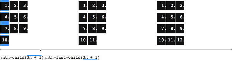
Now if—for some reason—we only want to target children where both nth-child and nth-last-child apply, we simply combine both selectors.

Top: A list with 10 items; items 1, 4, 7, and 10 are highlighted thanks to the combined effort of nth-child(3n + 1) and nth-last-child(3n + 1). Center: A list with 11 items; no items are highlighted as the combination of nth-child(3n + 1) nth-last-child(3n + 1) does not apply to any item. Bottom: A list with 12 items; for the same reason without any highlighted item.

Do you see where this is going? If not, maybe it’s time to wrap our children onto multiple lines.

Detecting a single element in the last row

The Flexible Box Module, usually referred to as flexbox, was designed as a one-dimensional layout model,

is what MDN has to say about flexbox. While there are key differences to CSS Grid Layout, which gives us two dimensions right out of the gate, flex items may also wrap, thanks to flex-wrap: wrap.

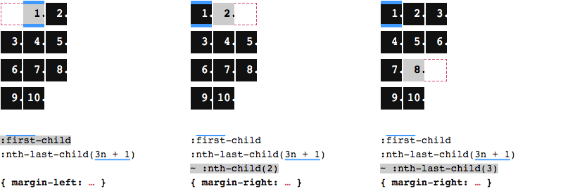
Let’s make the container wide enough to fit three (yes, 3n correlation) children. We wrap after every third child, which means 3n + 1 children will be first in their row.

Left: A list with 10 items, laid out in three columns and four rows; the items in the first column are highlighted thanks to both nth-child(3n + 1) and nth-last-child(3n + 1). Center: Another list the same arrangement, but with 11 items; same as before, the items in the first column are highlighted thanks to nth-child(3n + 1), but the items in the second column are highlighted thanks to nth-last-child(3n + 1). Right: One more list the same arrangement, but with 12 items; while nth-child(3n + 1) still highlights the items in the first column, nth-last-child(3n + 1) highlights the items in the third column.

In this flex-wrap scenario, only the container on the left happens to produce an orphan in the last row, which is also the one where nth-child and nth-last-child meet. For our CSS to apply only in cases where the total amount of children is 3n + 1, we once again combine the two selectors.

The same three lists as in the previous image, all laid out in three columns and four rows, from left to right with 10, 11, and 12 items respectively. While no items are highlighted in the lists with 11 and 12 items, the list with 10 items has the items of the first column highlighted, thanks to the combined effort of nth-child(3n + 1) and nth-last-child(3n + 1).

Doing so, we’ve selected all children that are first in a row, in other words the ones in the first column. And we’ve limited our selection to containers that produce an orphan child in the last row, while containers with a children count other than 3n + 1 are unaffected.

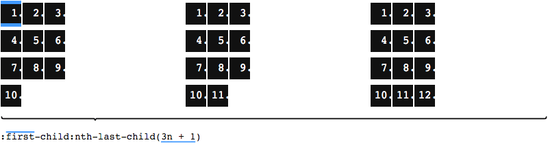
As we are not interested in these individual first-column children, we now reduce this even further, and only select the first child, by adding :first-child. As first-child also takes care of what we needed nth-child for, we may conveniently reduce it to :first-child:nth-last-child(3n + 1).

The same three lists as in the previous image, all laid out in three columns and four rows, from left to right with 10, 11, and 12 items respectively. While once again no items are highlighted in the lists with 11 and 12 items, the list with 10 items has the very first item highlighted, thanks to the combined effort of first-child and nth-last-child(3n + 1). This combined selector will be the base for the remaining steps that follow below.

Having selected the initial child in orphan-producing containers, we can now either do something with that child directly, or select any child that follows using the general sibling combinator.

Three lists with 10 items each, all laid out in three columns and four rows. Left: The very first item is chosen with the selector we’ve just discussed. Center: the second item is chosen by appending ~ nth-child(2) to our selector. Right: The eighth item is chosen by appending ~ nth-last-child(3) to our selector.

Here we are, ready to prevent an orphan element in the last row. The idea is to create an empty slot elsewhere, so that a second child gets pushed down into the last row. We choose a child and add a margin (left or right) to it, with the margin value being the element width. The use of margins is the reason why this will only work in a flexbox container, but not in grid. A margin on the left will shift the chosen child and all that follow. A margin on the right will only shift those after the chosen child. Which child should be the chosen one? That depends on the visual effect you want to achieve.

One last time we have three lists with 10 items each, all laid out in three columns and four rows. A margin is applied to a single chosen item in each list, resulting in some of the items being pushed one slot further towards the end, which in all cases leads to items 9 and 10 being placed in the last row, hence no orphan item in the last row. Left: The first item is chosen, a margin on the left is applied, which shifts itself one slot to the right, creating an empty slot in first column of the first row; as a consequence, all items in this list are shifted one slot. Center: The second item is chosen, this time a margin is applied to the right, so the item itself remains in position, but all following items are shifted one slot; we get an empty slot in the last column of the first row. Right: With the same right margin, but on item 8, the empty slot is where item 9 would otherwise be, i.e. in the last column of the penultimate row.

Interactive playground

This solution will work for any number of rows and columns. For fewer or more columns, simply adjust the container width and replace 3n with your desired value. To get an even better understanding, head over to my interactive version on CodePen, where you can play around with different settings.

Postscript: A word on gap

Adding a gap between the children is possible, but at the time of writing, setting a gap on flex containers is not supported in Safari. This can be achieved by setting a margin on each item, and negative margins on the container. No matter which one you add, gap or margin, the gap has to be taken into account when calculating the width of the container, and offsetting the items.