No web font, no cry
Essay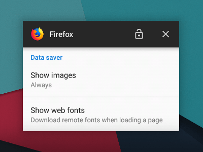
Apologies in advance to typography buffs, I mean you no harm, but this one is not for you.
Mobile makeover
A little bit of context.
End of last year I (successfully) installed LineageOS, a prerequisite for my attempt to un-Google my Android phone. In addition to the operating system, I no longer wanted to use apps from big G. To top it off, I even ditched Google Play Services. Saying farewell to the AppStore ecosystem causes some hardship every time I need to install or update an app, all of which has to be done manually now. (Not within the scope of this article, but you could google duckduckgo “side-loading apps”.) That said, some of you may recall that I keep the number of native apps to a minimum, as I prefer PWAs any day of the week.
Which brings me to the most important app, the web browser. Under normal conditions this would have been Chrome, but in this case using the browser from Google would undermine the whole exercise. Firefox to the rescue, thanks to Quantum they came back strong anyway. Side note: Not long ago someone on Twitter suggested that all web developers should switch to Firefox. Looking at recent browser stats we are once again right on track toward having one dominating browser. We have been there before, so this is not a drill.
Having Firefox installed, I went through the settings, where they gave me an interesting choice.
Font Off
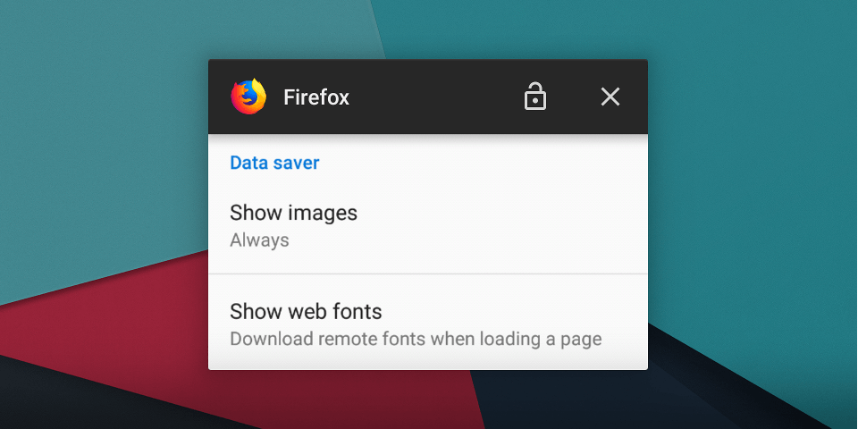
One of the perks of living in Austria is the inexpensive generous data plan you’ll have on your phone, so no need for eliminating the font download, right? Not quite, I also want my websites to load fast, so I gave it a try and turned off web fonts on my mobile. To this day, they are still off.
Any designer will tell you that a site design looses its character without the particular font it is supposed to come with. And they are right. But keep in mind, the site design is just the beginning, the World Wide Web is a rough place. In web design, there are many ways to present content, but there are always way more ways to consume it.
Responsive Web Design is not just about screen sizes. People have different needs. If someone browses the web using a screen reader, fonts are probably not a top priority, but the site must be accessible. The same is true if someone fancies to skip web fonts: The site should still be accessible.
Quirks
I’ve noticed in the last months that most sites work just fine, so even without their designated font they are perfectly usable. Only occasionally you see headlines run into paragraphs or something similar that would lead to unreadable text. Bottom line: Designers and developers have to try hard, i.e. put too much effort into pixel-perfect designs, for a site to break when web fonts are replaced by system fonts. Most text just reflows nicely. However, one big issue remains.
I was surprised to find out how many sites still use icon fonts given that SVGs are clearly superior. I’ve seen lots of buttons that display just a random letter instead, so good luck trying to figure out what is going on. While it is easy to guess that those broken icons in an auto-advancing carousel are the left/right arrows, what about a standalone button in the top banner? It could toggle the menu, open a search form, etc., so quite often your only option is to click to find out. At least somewhat easier to identify is this other weirdness, take the icons on this year’s Google IO site as an example. In the screenshot below, the left part shows the site with web fonts turned on, while on the right you’ll notice they are using icon fonts with ligatures.
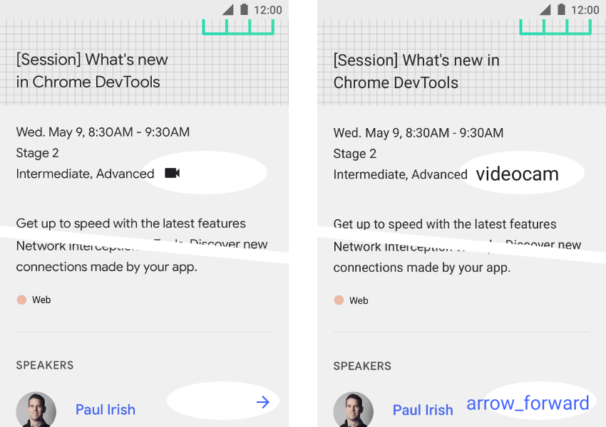
Even worse, sometimes I ended up seeing no text at all, so I might not even have noticed certain control elements. Sadly this happens whenever an icon font does the right thing by putting the icons in Unicode’s Private Use Area. This is just one more reason for developers to switch to SVG icons, but while we are at it, why not make things obvious.
That all being said, this is my just personal preference. Especially on mobile, where I do most of my reading these days, I do not mind the lack of beautiful typography and the presence of broken parts on websites, if the alternatives are FOUT and FOIT. What really bothers me is FOIT, where no text is shown while the browser is trying to load the font. Browsers do their best to ensure the text does not remain invisible for too long, but as this affects my ability to read the content I came for, I won’t return to FOIT land anytime soon.
But there is hope.
The Future
I turned off web fonts on mobile at a time when font-display was about to get some attention. We are already starting to see proper support, and I am eager to find out how browsers will handle the different values, especially auto. You’ll notice that font-display must be specified inside the @font-face rule, which can be out of your control if you use services like Google Fonts. But this is a topic on its own, something I’ll cover in an upcoming article. Stay tuned.