5vw FTW
Extra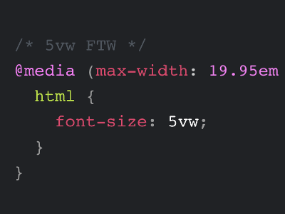
320 is the lowest number of pixels web developers usually look after when it comes to page width, but there are devices out there with even lower resolutions, e.g. 240. Below 320, unless you are using minimum or fixed width, your text might reflow just fine. But it could look weird. If so, instead of doing nothing, why not simply add …
@media (max-width: 19.95em) {
	html {
		font-size: 5vw;
	}
}
The above works under the assumption that your web page comes with a font-size of 16px on the root element, and every other element will use a relative unit like em or rem. Multiply 19.95 by 16 and you get roughly 319px, this is what we need for the media query.
By doing all this, using a font-size of 5vw for everything up to 320px will scale down your 320px layout to lower resolutions without reflowing text.
As always, test your design on actual devices that have such a low resolution, to ensure your text is still readable. It is worth pointing out that using the raw viewpoint unit on font-size disables zoom, which is bad for accessibility. But for a specific edge case like this one I’d say it’s a quick win.