Say “Hello” to device fragmentation
Essay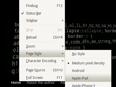
There is a mobile revolution going on. More and more websites are becoming mobile friendly. Also, devices are getting better and better.
The ones in our pockets no longer (more like never started to) define themselves as handhelds, at least when it comes to something called the media type. Because their web browsers are as good as desktop browsers, they decided they might as well embrace the full web. So they keep telling us: media="screen".
To cope with this fact, there is a lot of server-side user agent sniffing going on today. UAsmell, ergo sum. I wurfl, therefore I am. After some magic, the user gets the right CSS, the one that makes the site look good on the device.
Mobile view, desktop view
But not always. Even if we get the sniffing right, the user may still want to see the full page. So it is a good idea to provide a link to the full version of your site. Follow the link and you get the full site. No more sniffing is done, otherwise you’d bump into the mobile version again.
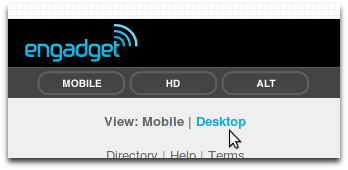
Many websites already do that, e.g., engadget. Whenever you decide to provide a mobile version, you should include such a link. Users usually expect it at the bottom of the page. Good practice.
For a recent project I designed more than just one zoom-friendly liquid design. Different styles for different devices. Mainly to get a similar look across all mobiles, no matter what size and pixel density they might have. All the way up to the retina display. So next to the desktop version, there has been a style for the Apple iPad, and many more in order to satisfy every mobile phone with a significant market share. Alright, just Android and iOS have been in the mix. Anyway, on top of that, all of them made good use of the screen estate in landscape and portrait mode, thanks to media queries.
I ended up with all the things I just mentioned. User agent sniffing to identify my target devices, they will get a special treat. And a liquid design for everything else. My work has been done.
Right, the work has already been done. Why not spread the word? If Mobile should provide a link to Desktop, why not go the other way around?
Desktop view, any view
Maybe there are people in front of a PC or Mac who would enjoy a “mobile” layout in their regular web browser. Maybe one of the alternate designs would make more sense to them than the main one. Enjoy the one designed for the iPad in Firefox … why not?
Who knows. All you know for sure is that there are a gazillion screens. So many form factors. Some have touch input, others don’t. Whatever, for once, let’s give our regular visitors a choice.
Alternate style sheets
We start by adding all the designs we already have as alternate style sheets. There is nothing fancy about this. Frankly, that technique is quite old. Check out alistapart to see how it is done. But be careful. That link takes you right back to 2001. You’ve been warned.
I add the alternate style sheets only to the desktop version, because currently I do not see how to make use of them on a phone. Okay, all my additional designs are defined as alternate style sheets. Now what? Take Firefox. This browser lists our alternate style sheets and let’s you choose the page style. You could even look at the page with no style at all.
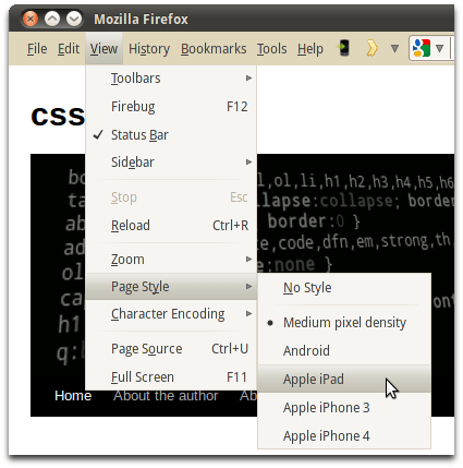
Sure, this may be good enough for tech-savvy web surfers with a capable browser, but who’s going to check if there are alternate style sheets‽ Next stop: JavaScript. You can provide a style sheet switcher, as seen on css-tricks.com. With the switcher in place, visitors have a visual cue to stumble upon. And if they make an alternate choice, this choice can be made permanent with cookies, for future visits.
A few things to consider
Doesn’t this approach require you to have your styles separated? First of all: I encourage you to separate styles. Mobile users are happy when they get their pages fast. Please do not deliver stuff to them that belong to your desktop version. Mobile bandwidth is precious (and sometimes expensive). Also, as Sarah Parmenter pointed out, some phones may load more than you ever get to see.
But all this doesn’t necessary lead to code duplication. If your style sheet’s link tag lacks a title attribute, the contained styles will always be applied, no matter what alternate style sheet the user chooses. So you can put your common CSS there. And as always, the style sheets themselves may include others. But sure, for this to work, you need all the referenced .css files as defined in the HTML file, since this is the only place to distinguish between alternate style sheets.
More .css files, more HTTP requests! True. But this is one of the few topics where I cannot recommend reducing them. JavaScript aside, you’ll end up with at least one .css file for each version of your site. To get there, instead of using @includes, your server probably needs to pour the shared code in each of said files. Not good. Because some browsers prefetch all alternate style sheets, that way any performance boost you’ll get from fewer HTTP requests is gone.
What about things that won’t work on the desktop browser, like using a vendor-prefixed media query such as -webkit-min-device-pixel-ratio? Well, once you’ve separated the styles (maybe you’ve got an iphone.css and a retina.css) this query may become obsolete. But you’ll have to look at each situation individually. It will be easier if you are able to plan ahead. If you already know right at the start of a project that you’re going to add your other designs as alternate style sheets to your desktop version, you will most likely choose to implement media queries in a different way.
Empower the desktop version of your site! Let the user decide about the design.