Superior Range Syntax
Code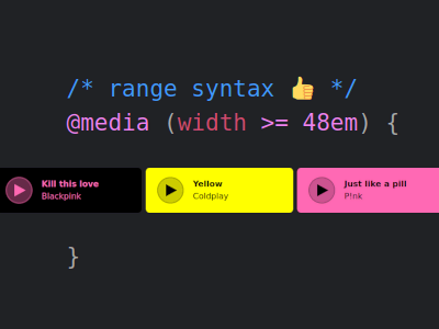
Whoopsie, when I wrote »Is CSS alive?« earlier this year, I completely forgot to mention another Baseline 2023 feature: The media query range syntax, which allows us to be more concise when querying the viewport size. But in my opinion this is not even the best part.
First things first. This is how the range syntax differs from the good old viewport size media queries.
@media (min-width: 48em) {
	/* styles for viewport size 768px and above */
}
@media (width >= 48em) {
	/* same as above, but using range syntax */
}
Things get even more concise when you need to query between lower and upper bounds.
@media (min-width: 48em) and (max-width: 64em) {
	/* styles for viewport size from 768px to 1024px */
}
@media (48em <= width <= 64em) {
	/* same as above, now range syntax is way shorter */
}
So what’s the best part?
As you’ve seen, I’ve been using the em unit instead of px. If you are a pixel person[1], the following may not be as important to you. Then again, some bits may be, so keep reading just to be safe.
Imagine you have a breakpoint at 768 pixels, which is 48em at a root font size of 16 pixels.
If you need two types of queries in your stylesheet, one where the breakpoint is not yet reached, and one where it is, in the olden days you had to do the following.
@media (min-width: 48em) {
	/* when viewport size is 768px and above */
}
@media (max-width: 47.99em) {
	/* when viewport size is below 768px */
}
That weird 47.99em happens to be 767.84 pixels. Why not use 47.9375em, which is precisely 767 pixels? For starters, it is longer, but more importantly you may run into issues on displays that use fractional scaling. If someone uses 1.5x fractional scaling (or 150% scaling) on their OS, a browser might end up with a calculated viewport width of 767.5 pixels, which may cause an in-between state, where none of the two media queries kicks in. To avoid that, I use two digits for the fractions, the second always being nine.[2]
Anyhow, you may already know where this is going. Here’s the new improved way.
@media (width >= 48em) {
	/* when viewport size is 768px and above */
}
@media (width < 48em) {
	/* when viewport size is below 768px */
}
Thanks to the ability to go with or without an equals sign in the comparison, we can write 48em in both cases. 🥳
As an added bonus, this makes it easier when you search for breakpoints in your code.
As an added added bonus, the aforementioned issue with fractional scaling can be avoided if you use the range syntax.
The missing chapter
What follows is the chapter that should have been in my »Is CSS alive?« essay.
Media query range syntax
Syntactic sugar? Far from it. Thanks to the new range syntax we finally have a proper way to query the viewport size, i.e. the thing that has opened the door for Responsive Web Design many years ago.
Verdict: Use it, and never look back.
The music player postscript
I’ve created a CodePen that makes use of the aforementioned breakpoint at 768 pixels to decide which piece of music you should listen to, because why not. It uses five ways to determine the breakpoint:
pxunit, old syntaxemunit, old syntax, 1 digit for precisionemunit, old syntax, 2 digits for precisionemunit, new range syntaxpxunit, new range syntax
The hard part is getting it to show Coldplay’s “Yellow”, which will only be presented at viewports somewhere between 767px and 768px, if at all. I managed to get it shown on a device with 150% scaling running Windows. I opened Responsive Design Mode in Firefox’s DevTools (or Device Toolbar in Chromium’s DevTools, Device Emulation in Edge’s DevTools), and then set the window width to 767px, The result was that the first two methods went “Yellow”, only the old syntax with sufficient precision and obviously the new syntax did not.
This and the green light from caniuse should be enough reasons to only use the range syntax from now on.
Footnotes
- After all, we are past those Safari issues from eight years ago. Are we? ↩︎
- This means even the pixel people must go beyond integers to avoid those issues. ↩︎