Six levels of dark mode
Essay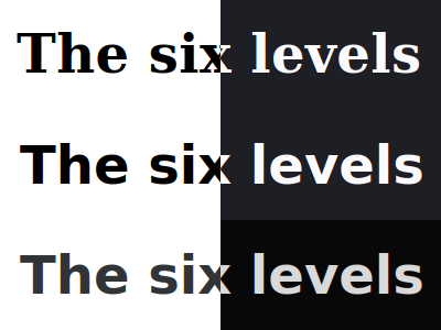
Being reminded of the visually hidden debate hasn’t been the only thing that happened to me on this year’s CSS Naked Day.
I’ve observed that on pretty much all the sites I’ve visited, dark mode was rather absent after the styles had been removed. This got me thinking, maybe it’s time to talk about the six levels of dark mode.
A less catchy—but more accurate—title for this blog post would have been “six levels of color scheme switching”. Oh well. Most of the example code in this article shows the dark side, so the title does make sense. Just keep in mind that the other way around also works.
Enough said, let’s get to it.
Level 1:
Barebone
This level is as easy as it gets, but apparently the underlying directive was missing on the sites mentioned in the introduction. You can opt into light/dark mode differentiation even without a single line of CSS, which is great in general, but especially on April 9.
Simply add the following meta tag to the document head, and you are good to go.
<meta name="color-scheme" content="light dark">Whenever a web page contains this tag, the browser knows it should adhere to the user’s color scheme preference. The order of the entries in the content attribute matters, at least in theory. Users without a preference for a color scheme would get the first in the space-separated list. But the settings in today’s operating systems lack the option to *not* choose one, so you’ll always end up with the one that matches the OS.
You could just specify a single entry in the content attribute. Doing so would enforce the corresponding scheme, without taking the user preference into account, but that’s another story.
To some degree, the meta tag is the HTML equivalent of our next level.
Level 2:
Basic
Let’s move on to the CSS way of light/dark mode differentiation.
html {
	color-scheme: light dark;
}
You won’t need this declaration if you already have the meta tag in the DOM. Unless you have no control over the HTML (e.g. if your content comes from a CMS, poor you), I encourage you to always use the meta tag. This gives the browser a <head> start, as it already knows about the color scheme directive before any CSS has been parsed.
Both ways essentially give you the option to piggyback on user agent default styles, and the light and dark mode that comes with them. Now add some CSS, but maybe limit yourself to the use of CSS system colors while doing so, and you will already be able to achieve quite neat designs. Heck, the page style switcher on this site has entries named ‘None’ and ‘Basic’, they correspond to levels 1 and 2.
Which brings us to the point where the two ways differ. Unlike the meta tag, which always applies to the whole document, the CSS color-scheme declaration can be set anywhere, not just on the root element. This enables some additional usage scenarios, but I’ll address those in another blog post.
Level 3:
Benign
We are past the basic stage, but still in shallow waters. A rather recent addition to CSS, namely the light-dark() color function, allows for simple light/dark mode adjustments.
html {
	background-color: light-dark(black, white);
	color: light-dark(white, black);
}
The function takes two arguments, both should be colors. The first will be applied in light mode, you may guess what the second argument is for. Whether you simply specify actual colors, or even throw in custom properties that resolve in colors, is up to you.
This is the only part level in this whole blog post where browser support is not great at the time of writing, but we’ll get there.
Level 4:
Bold
Moving on to the good old media query.
@media (prefers-color-scheme: dark) {
	html {
		background-color: black;
		color: white;
	}
}
Whether you query for light or dark, the media query allows for maximum customization, as you are not limited to merely changing colors. You can put anything in there. Wanna use a filter to desaturate images in dark mode? Go for it. Replace box shadows with colors? Sure.
Level 5:
Bisectional
You can use the media query in HTML too. Adding it as a media attribute allows you to create style sheets for each scheme.
<link media="screen and (prefers-color-scheme:light)" rel="stylesheet" href="light.css">
<link media="screen and (prefers-color-scheme:dark)" rel="stylesheet" href="dark.css">
Dedicated files make sense if you do a lot of customization. The browser may ignore any CSS file that does not match the query, so there’ll be one less thing to download.
Level 6:
Ballistic
Obviously JavaScript wants to play a part in this too. You can use the matchMedia function to query for either light or dark scheme, just like any other media query.
const isDarkScheme = window.matchMedia('(prefers-color-scheme:dark)');And then do whatever.
In reality, you don’t stay within one lane, you can mix and match the techniques from all the aforementioned levels.
Level 7:
Beyond
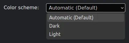
You don’t need to solely rely on the user preference, you can build a color scheme switcher.
If you do, be careful, the preference for either light or dark mode is not a boolean state, because initially you want to default to ‘Automatic’, i.e. adhere to prefers-color-scheme. By building a scheme switcher on top of that, you allow the user to opt into one of the three modes.
If you already knew everything you’ve just read, I’ve got one more for you.
Level 8:
Beguiling
When web developers create a level 7 color scheme switcher, they usually either add a class like .dark to the HTML element, sometimes even a fancy data-theme="dark" attribute.
Well, we no longer need either one, because we can use :has() to query the real deal.
html:has(meta[name="color-scheme"][content="dark"]) {
	--color-bg: black;
	--color-text: white;
}
Check out my accompanying piece »Color scheme switcher, 2024 edition« to see it live.