Print First
An Alternate Approach to Mobile First Web Design
Essay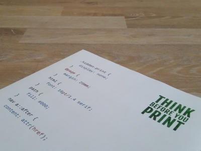
Back in 2009, when LukeW instilled importance on why the web should be designed Mobile First, he provided the snowflakes for the paradigm shifting avalanche that followed. The web community responded with a lot of hubbub, but that was just the inevitable sound that comes with any avalanche.
Thankfully, Jeremy calmed everyone down by stating that content is always key:
Start with the content, not the device.
Make sure you have content worth putting a design on top of. If there is still time at the end of the day you can always throw in more breakpoints, tweaks for high resolution displays and polyfill scripts to enable responsive images cross-browser.
But before you do all that, have everything marked up in a semantically meaningful way and make sure you know the default styles browsers have to offer.
I am not talking about leaving your web pages unstyled, this is 2015 after all. I suggest you start without media queries. Keep in mind that having no media query is already the first media query. That in turn means we already have our first style. Unsurprisingly, this initial style is going to be the print style. You did read the title of this article, right?
Fine, but who prints web pages?
Whoa, you took that literally? What I meant is, if it is good enough for the often neglected print preview of your modern browser, it stands the chance of looking good anywhere else, including less capable browsers. By doing so you are providing an experience similar to what the reader mode in a web browser or a dedicated app will give you.
How it is done
Until now, after you have pieced together your print style declarations, you either put them in a dedicated file or you saved that HTTP request by adding them to your regular style sheet, embedded within a @media print query.
Why not do even less? With Print First, you simply use the print style as your default, and then work your way towards the screens. Within those media queries for the screen, you can—and should—still design mobile first. Or smartwatch first.
Make sure to embed your style sheet in your HTML document without any media attribute, or with media="screen, print". Here is how the style sheet will be structured:
/* place print styles outside of any query */
@media screen {
	/* generic screen styles here */
}
@media screen and (min-width: …) {
	/* add breakpoint-specific styles */
}
Without mentioning print anywhere, the printed version of your website will pick up all style declarations outside those media queries and ignore anything within @media screen. But it does not stop here. Older browsers unaware of media queries will also render the print style as a default. The print style now acts as a replacement for any generic fallback layout, which in most cases would have been a centered single column layout with a fixed width. Although you no longer need an alternate fallback, you might want to make sure there is a max-width in your Print First design. Maybe one that is large enough so it does not affect your print version but ensures readability on screens by limiting the number of words per line.
You can of course still add media queries for @media print, perhaps because you do not want to see pt units loitering in your default. Just make sure that those older browsers living outside of query land pick up everything intended for your default design. While we are at it, be aware of a sometimes overlooked fact: Media queries add no specifity to your CSS selectors, only source order matters.
Needless to say, with Print First you will encounter situations where have to you override CSS values that would otherwise be hidden behind @media print to get things going on the screen. IMHO, a small price to pay for getting a smart default.
Conclusion
Focusing on the content should always be your first priority. Having semantic markup in place is the first step. Design your print version—Print First calls it default or fallback—on top of that, and expand to all kinds of screens.
Using a simple print style as a default is certainly beneficial for older versions of Internet Explorer. This happens to be my primary motivation, as I no longer have to do extra work to support older browsers. Instead, I simply deliver a basic experience to them. An experience worthy to be put on paper.
The basic experience is back anyway, now that browsers add a reader mode to get rid of the bloat. Maybe basic is the new black. Remember, this basic experience is already responsive, because unless we mess it up, websites are responsive out of the box. Always have been, since day one.